Sunday, 30 October 2011
Images From My Photoshoots That I Will Not Use
I will not use this picture in my music magazine because my model has a red eye and I have also cut off part of her elbow when taking the picture.
I have decided not to use this image in my magazine because I do not like the angle that I have taken it at.
This picture will not feature in my music magazine, as the top of my model's head is not in the frame.
I will not use this picture because I do not like the position of one of the model's head. Also this photoshoot was set up so that I could take pictures for my front cover. Therefore I needed the image to be a mid-shot.
This image will not be used because I would of preferred it to be a mid-shot instead of a long-shot.
The reason I will not use this picture in my music magazine is because I do not like the lighting.
I do not like the lighting in this image so I will not use it.
This image is not suitable for my magazine because one of my models is looking away. Another reason is because they are both crouching down in the picture, which makes them look really small.
Although I like the positioning of my models in this picture and how they are posing. I do not like how the light is reflecting off of them both.
Saturday, 29 October 2011
My Photoshoot
Photoshoot 1
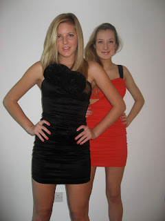
For my main photoshoot I wanted it to look like the photos had been taken in a professional studio, therefore i used a white wall for the background which helped to create this effect. Although there is a plug socket on the wall this does not matter as I can edit it out in Photoshop. I decided to put my models first of all in trousers, t-shirts, glasses and blazers as this gives the photos a 'Rock Chick' feel. I then changed them to evening, party dresses as this type of clothing is typically worn by female music artists that feature in magazines, therefore I chose to do this as it will make my magazine conventional. Both of the models make direct eye contact with the reader in all of the photos as this helps to attract the reader's attention.
Below is a slideshow of all the original photos that have the potential to be either on the front cover of my music magazine or on the contents page. However, some of the photos are long shots instead of mid shots, this means that if i chose to use one of these images, that is a long shot, as my cover picture I will have to edit it first.
Photoshoot 2
For this photoshoot I wanted to give the images an edgy more urban feel instead of making them all look like they had been taken in a photography studio. I knew of a local field so I decided to use this as the setting for my second photoshoot. I dressed my models in jeans, vest tops and military boots as this fitted in with the urban/edgy feel that I wanted to create. I also changed the model's hair by putting it in a side plait so that it wasn't styled the same as it was in the main photoshoot.
Below are pictures, from Google Maps, of where I took my photos.
Satellite View of the location.

Map View of the location.
Below is a slideshow of all the original photos that have the potential to be either on the double page spread of my music magazine or on the contents page. In some of the pictures I have used the technique of the Rule of Thirds by putting the models of the left hand side of the photo, this will then allow me to put the writing on the right hand side without it affecting the image by overlapping my models. It also allows the background to carry across both pages.
Photoshoot 3
The images that I took at this photoshoot are for my secondary solo artist which I will put on the contents page and maybe on my double page spread as they could be a collaborator with my band. I started off by using a white wall to make my photos look like they had been taken professionally. However, I then changed to having a brick wall as my backdrop as this gives a different look to my images but they also fit in with the urban feel I created in my second photoshoot. If I do end up putting one of these images on my double page spread then this will fit in nicely. I dressed my solo artist in jeans and a pretty blouse as I want this clothing to signify a pop artist, who normally wears girly clothing, rather than an R&B artist who would dress differently.
For my main photoshoot I wanted it to look like the photos had been taken in a professional studio, therefore i used a white wall for the background which helped to create this effect. Although there is a plug socket on the wall this does not matter as I can edit it out in Photoshop. I decided to put my models first of all in trousers, t-shirts, glasses and blazers as this gives the photos a 'Rock Chick' feel. I then changed them to evening, party dresses as this type of clothing is typically worn by female music artists that feature in magazines, therefore I chose to do this as it will make my magazine conventional. Both of the models make direct eye contact with the reader in all of the photos as this helps to attract the reader's attention.
Below is a slideshow of all the original photos that have the potential to be either on the front cover of my music magazine or on the contents page. However, some of the photos are long shots instead of mid shots, this means that if i chose to use one of these images, that is a long shot, as my cover picture I will have to edit it first.
Photoshoot 2
For this photoshoot I wanted to give the images an edgy more urban feel instead of making them all look like they had been taken in a photography studio. I knew of a local field so I decided to use this as the setting for my second photoshoot. I dressed my models in jeans, vest tops and military boots as this fitted in with the urban/edgy feel that I wanted to create. I also changed the model's hair by putting it in a side plait so that it wasn't styled the same as it was in the main photoshoot.
Below are pictures, from Google Maps, of where I took my photos.
Satellite View of the location.

Map View of the location.
Below is a slideshow of all the original photos that have the potential to be either on the double page spread of my music magazine or on the contents page. In some of the pictures I have used the technique of the Rule of Thirds by putting the models of the left hand side of the photo, this will then allow me to put the writing on the right hand side without it affecting the image by overlapping my models. It also allows the background to carry across both pages.
Photoshoot 3
The images that I took at this photoshoot are for my secondary solo artist which I will put on the contents page and maybe on my double page spread as they could be a collaborator with my band. I started off by using a white wall to make my photos look like they had been taken professionally. However, I then changed to having a brick wall as my backdrop as this gives a different look to my images but they also fit in with the urban feel I created in my second photoshoot. If I do end up putting one of these images on my double page spread then this will fit in nicely. I dressed my solo artist in jeans and a pretty blouse as I want this clothing to signify a pop artist, who normally wears girly clothing, rather than an R&B artist who would dress differently.
Below is a slideshow of all the original photos that have the potential to be used in my music magazine. I have used a mixture of mid shots and long shots.
Friday, 28 October 2011
Tuesday, 18 October 2011
Monday, 17 October 2011
Sunday, 9 October 2011
My Analysis Of My Front Cover And Contents Page
My Analysis Of My Front Cover.
My Analysis Of My Contents Page.
Friday, 7 October 2011
Wednesday, 5 October 2011
Monday, 3 October 2011
My Contents Page Images
These are the images that I think I will use on my contents page.
I feel this picture is appropriate because it shows he girls looking through their work and holding folders, which signifies school. The school can also be seen in the background.
I will use this picture for my contents page, as i like the lighting because it gives the image a positive feel. The girls are also smiling, which helps to create a positive atmosphere.
I feel this picture is suitable for my contents page because my models look like they are having fun, which represents the school in a positive view.
This picture signifies a school because my model is holding folders and looking at work. The school building is also visible in the background of the image.
My Front Cover Image
Out of all of the pictures that I took, this is the original image of the one I will use on my front cover before editing it.
This is the image after I have edited it.
I have cropped this image as I felt that there was too much space on the left hand side of the picture. By doing this it makes Isabel the focal point in the picture, which draws the audience's attention to her as she is now central. Even though I have cropped the picture I have still left enough room at the top of the image for a masthead and down the sides so that i can fit in featured articles. I have also boosted the colour as this makes the image brighter and it brings out the individual colours within the picture. I like this picture because Isabel is forming a relationship with the reader as she is making direct eye contact with them, which engages the audience. She is also holding some school books and a bag which helps to signify school. Also by having part of the school in the background it gives an insight into what the Magazine is about. Isabel is smiling in this image, which signifies that she is happy, this gives a positive representation of the sixth form to the reader.
Subscribe to:
Comments (Atom)


