Monday, 28 November 2011

Deciding The Font For My Band

I then had to decide which font I wanted to use for my band. This font will be used as a signature logo for the band, so that it becomes recognisable by their fans. 

Masthead 1

Masthead 2


Masthead 3

Masthead 4


After designing a few fonts I asked my focus group which one they preferred. Here are the results.
It is clear that my target group preferred Masthead 3, therefore I will use this design.

Thursday, 24 November 2011

Analysing A Contents Page


  • I really like the look of this contents page from Q magazine. Therefore I am going to consider using pictures on my contents page that are labeled with page numbers.
  • I like how they have used an image of what the article looks like and that in the corner there is a page number which stands out.
  • By putting page numbers in the corner of the picture the reader knows what page that article is on straight away. This means that if the reader likes the look of the article it is easy for them to find it quickly.
  • They have also created a house style by making the page numbers all the same size and colours.

Creating My Contents Page For My Music Magazine


Firstly I designed my Masthead for my contents page. I used the same font for the word 'contents' as I did for my masthead on my front cover. I also used the same beat symbols, as this creates a logo for my magazine so that people recognise it. It also gives my magazine a house style and continuity.


I then created a layout for my page by drawing black lines to form columns.


In the centre column I decided to add pictures so that my reader can see what else will feature in this magzine. It also adds colour to the page.


Underneath my masthead I put sub-headings in the left and right column. The reason I named one of the columns 'on the cover' is because if the reader sees a story that they like the look of on the front cover it is much easier and quicker for them to find which page it is. The column 'also in this issue' shows the reader what other articles feature in the magazine apart from the ones on the cover.

Here is a screen shot of part of the 'one the cover' column. I have made the page numbers stand out so that the article is easy to find. I have also made them all the same size and colour, as this creates a house style. I decided to give each artist their own font, as this recognised by their fans. I have also included a little bit about what the article is about or a quote from the article underneath each name.


This is what my page looks like so far.


This screenshot shows both completed coloumns. At the bottom of the right-hand column I created a 'subscribe' section, as this is a common element in all magazines. 


This is the completed contents page. I have put numbers on the pictures in the center, as this shows which picture relates to which article. I have insert an image of the ACE article, as this is the main article in the magazine.


Tuesday, 22 November 2011

Creating My Double Page Spread For My Music Magazine

This is the picture that I am going to use for my Double Page Spread. I have edited it in Iphoto.


After choosing the picture that I will use for this page Double Page Spread, I will then start making my magazine in Photoshop. This is the image that I am going to use for my Double page spread. I have spread the picture across both of the pages as when I write my text on the right hand side I don't just want the background to be white. This layout also allows me to have a picture of my band on its own so that the text does not take any attention away from the picture. 


I then decided to add my magazine's logo to the Left and Right hand corner, at the bottom of the page. This is seen in the music magazine that  I have been researching. It also ties my magazine together and creates a House style. 


Here is a screen shot of where I have put my 'Exclusive' and the word 'ACE' on the page. This also shows the sizing that I have used.


This is a close up of the left-hand side of the page.


This screenshot shows what the outter bottom corners of each page will look like. I have included the masthead of the magazine, the page number which is in the same style as the contents page and the date of the issue. This all creates a house style and shows continuity.


This image shows the transparent green box that the article will be inside. This shows the positioning and the size that the article will be. I decided to insert a box, as this will make the text easier to read but it still allows the reader to see the image through it.


Above the article box I have insert a picture of each band member and their name. This allows the reader to relate to the member and it also helps them identify who is who.

This is a screenshot of how the page looks so far. I have added the title of the article.

This is my completed double page spread.


My Finished Front Cover


Sunday, 20 November 2011

My Double Page Spread Article

The back story of my article is going to be that they are an emerging band so it is at the beginning of their career. Therefore the purpose of my article is to inform and educate the reader about this up and coming band. I could inform the reader about how they started their career, their history and what genre of music they perform. Another purpose of my article could be to encourage the readers to listen to and download the bands music. I want my audience to admire their hard work and effort but I also want my audience to relate to this new band. Through my article I am trying to encourage my reader to buy their new release and I want them to believe the article. My band is represented in terms of gender as they are female so females will relate to them, age as they are younger so teenagers can relate to them and genre, what type of music they perform.

Analysing A Double Page Spread


  • Next to Ed it says 'winner breakthrough artist' this suggests that he has won the award for breakthrough artist.
  • In the bottom corner of both of the pages there is the logo of Q magazine. 
  • The page number is in a black box with white writing so that it contrasts and is easy to read. There is also the date of the issue.

  • At the top left hand corner of the left page there is the Q logo and the words 'Awards 2011' this tells the reader what section of the magazine the article is in.

Wednesday, 16 November 2011

My Masthead


This is the masthead that I am going to use for my magazine. I think the name is suitable as the word 'Beat' is
associated with music. It is also short and snappy. The beat symbols are related to the word 'Beat' and I like how they blend into either side of the word. This makes it look like the beat symbols are creating the word. I will leave this masthead as black because this makes it stand out against the background of the image. This means that it will be easy to see so the reader will notice it.

Semantic Field

My genre is 'Pop/Indie'

Here is a list of words that could be used in my article that are linked to my band:
Concerts
Fashion
Parties
Dance
Beat
Lively


Inter-textuality

What would my band be interested in?
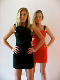
My band is made up of two girls. They are called ACE. The songs that they sing are a cross-genre of Pop and Indie. In their spare time they enjoy going out to parties, concerts or festivals. Spending time with their friends and family, shopping and listening to music. They are interested in giving up with the latest fashion trends and also setting their own. These girls like to wear party dresses and heels. Therefore they may not be suitable for a younger age market, as they like to reveal flesh and look attractive. Although they appear in the media they don't want people to read negative stories about them, therefore they are down to earth and do not behave badly. They want to set a good example and become inspirational to their fans.


Thursday, 10 November 2011

What I did Today

Today I designed my questionnaire and uploaded it to blogger. I then added my masthead to my magazine using Photoshop.

My Questionnaire

Create your free online surveys with SurveyMonkey, the world's leading questionnaire tool.

Wednesday, 9 November 2011

Music Magazines

Front Covers
The front cover is a persuasive selling tool.
They motivate the audience to buy the product.
They establish their own identity to cultivate a brand loyalty.
The front cover shapes the readers expectations.
The readers are invited to join communities with distinct cultural identities.
The prime position for important information is the top left hand corner.
You need to consider the layout and graphology and colour.

Sentence Functions
Declaratives - making a statement.
Imperatives - giving orders.
Interrogatives - asking questions.
Exclamatives - surprise or alarm.

Intertextuality
Where we are reminded of another form of media or sayings.
In music magazines they often refer to films.

Information value - the placement of elements that reflect their importance.
Saliance - the relative size of subjects that reflects its worth.
Framing Devices - connect or disconnect elements.

Editorial
Consider the relationship between the text producer and the reader.
In music magazines it is to review and recommend.
In the editorial the style corresponds to the style of the magazine.


My Edited Pictures

These are the pictures that I will use in my music magazine.

This is the image I will use for my Front Cover.

Before Editing
This is the original photo before I edited it in Iphoto.


After Editing
This is the image after I have edited it in Iphoto. I decided to use the tool 'colour boost' as this boosted the colours and made them look more vibrant than before. It also gives definition to each individual colour. I then removed the plug socket by using the 'retouch' tool. I removed the plug socket as I felt that your attention was draw to it and it made the image look unprofessional. I enhanced the highlight level and the definition level as this made the image brighter and it also made the image shaper. I then used the 'de-noise' tool as this made the image less pixilated.


This is the image I will use for my Double Page Spread.

Before Editing
This is the original image before I have edited it using Iphoto.


After Editing
This is the image for my double page spread, after  I have edited it in Iphoto. I used the 'colour boost' tool, as this boosted the colours which made the picture look more vibrant. I also adjusted the levels of the image as this helped to enhance the colours. I then changed the 'saturation', as this increased the intensity. I then decided to increase the 'definition level' and the 'highlight level'. this improved the sharpness of the image. Finally I increased the 'de-noise' tool which made the picture less pixilated.


This is the image I will use for my contents page.

Before Editing
This is my original image before I edited it in Iphoto.


After Editing
This is the photo after I have edited it using Iphoto. Firstly I boosted the colours in the picture using the 'boost colour' tool. This made my image brighter. I then changed the exposure, as this changed the lighting. I also changed the contrast tool, which gave my model's skin a warmer tone. I increased the sharpness, as this increased the focus of the image. I finally changed the 'de-noise' tool so that it improved the quality of the picture and made it less grainy. 


Tuesday, 8 November 2011

Creating My Front Cover For My Music Magzine

This is the picture that I have chosen to use as my front cover image. I have edited this picture in Iphoto.


I am going to use Photoshop to make my Music Magazine. After choosing the image for my front cover I then made it my background on Photoshop. This enables me to then add a masthead.


Here is a screenshot, which shows my front cover with the masthead. After adding the masthead I decided to erase part of the 'E' and the 'A' as I didn't like how the masthead covered the tops of both of my model's heads. By doing this I have made the masthead look like it is behind the models. 


This is my finished Masthead. I added a heart beat symbol either side of the word 'Beat' as this symbol signifies a beat, which fits in with my music magazine.


I then had to make the decision of whether to put a box around the barcode, date and price. I thought the box made it stand out and how the other design is not as visible so therefore does not attract the reader's away from the main photo. As a result of this I chose to use the design without the white box.

This is my front cover so far. I have added my 'Exclusive' story. I wanted the word 'Exclusive' to be in red as I want it to stand out because it is my anchorage text, so therefore it is important. Also because my model is wearing black I wanted the word to be in a contrasting colour, instead of blending in with what she is wearing. I have added some text about getting a free CD as I feel that this will attract readers to purchase my magazine because of the promotional offer. On the other side of my magazine I have included the names of solo artists and bands as this will encourage my reader to buy this magazine if they see an artist or band that they like is featuring in the magazine.


At the top of my magazine I have added an article about another Solo Artist that is featuring in my magazine. However, I am not sure if I am going to keep it at the top of my magazine near my masthead as I don't want to make it clustered or detract the reader's attention away from the main image.